How ADbuddy looks, and how it sounds.
For our team, partners, printers and anyone writing about us. Use the files below as they are, keep the colours and fonts consistent, and write the way we talk: plainly, with real numbers.
Write it ADbuddy.
Capital AD, lowercase buddy, one word. In the logo it appears in capitals, but in text it is always ADbuddy. The company's full legal name is ADbuddy Digital Media Private Limited.
Two versions and an icon.
Use the white version on navy and other dark backgrounds, and the black version on white, yellow and other light backgrounds. The blue icon never changes colour. Use the icon on its own only where the name is already visible or space is square, such as a profile picture.

Clear space
Leave empty space around the logo at least as tall as the A in ADBUDDY. No text, edges or other logos inside it.
Minimum size
Below these sizes the “Digital Media Private Limited” line becomes unreadable. Use the icon instead.
Please don't
The logo animation.
The icon is drawn in outline, fills with colour, the sound bars slide out, and the name is revealed from left to right. Use it at the start of videos and presentations. Don't speed it up, reverse it or add other effects.
Navy first. Yellow for the one action.
Most of a page or post is navy. Blue marks labels, links and key words. Yellow is for the single thing we want people to do, like a button, so use it sparingly. Click a colour to copy its code.
Roughly: navy 60% · deep navy 15% · white 12% · blue 8% · yellow 5%
Main background. The colour people remember.
Cards, panels and alternate sections on navy.
Links, labels, highlights, key words in headlines.
Main buttons and the one thing you want clicked.
Body text on navy. Never on white.
Headlines on navy, and light backgrounds.
The logo uses its own two blues, #00B0F0 (logo blue) and #63C8FF (logo light blue). Use them only inside the logo, never for text or buttons.
Two fonts, both free.
Headlines in ExtraBold (800) with slightly tight letter spacing. Body text in Regular or Medium at a comfortable size. Free on Google Fonts.
Every lead answered in under a minute.
Only for short labels above headlines, step numbers and small details. Uppercase with wide letter spacing. Never for paragraphs. Free on Google Fonts.
Built for your industry
The logo is set in Geomanist. It belongs to the logo only, so don't use it for headlines or recreate the logo by typing it.
Real people doing the real job.
Show the actual subject: a roofer on a roof for roofing, a salon for salon advertising. Keep photos in full colour and clear. When text has to sit on a photo, darken only the part under the text.

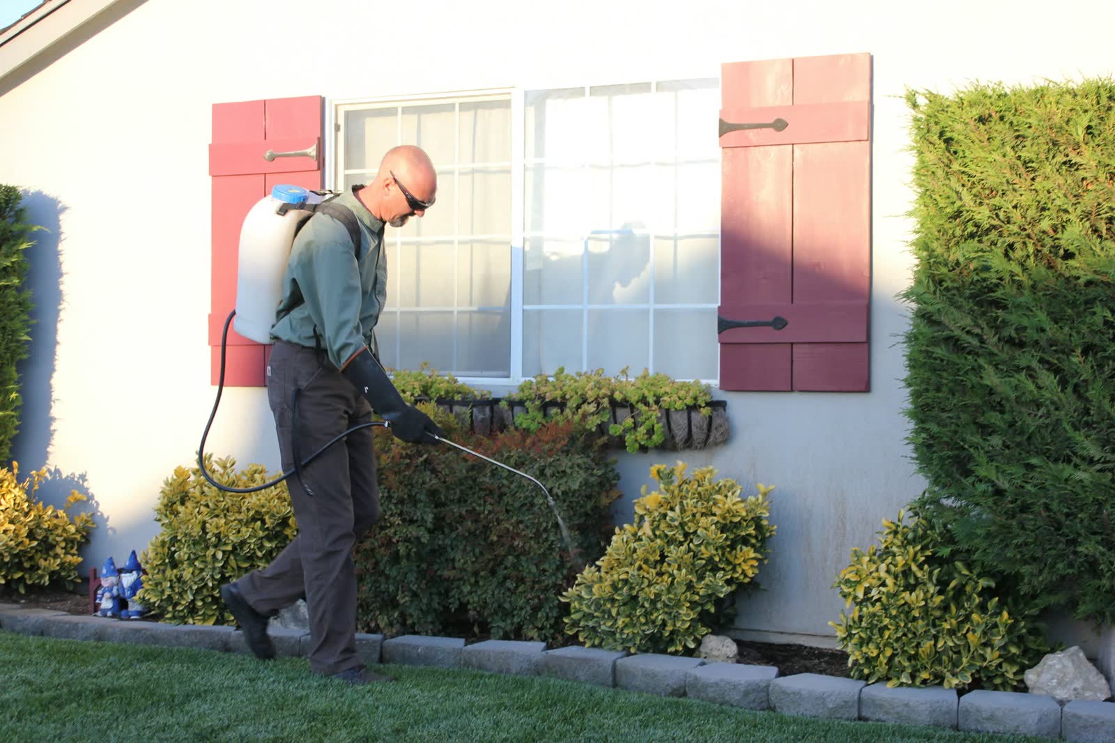
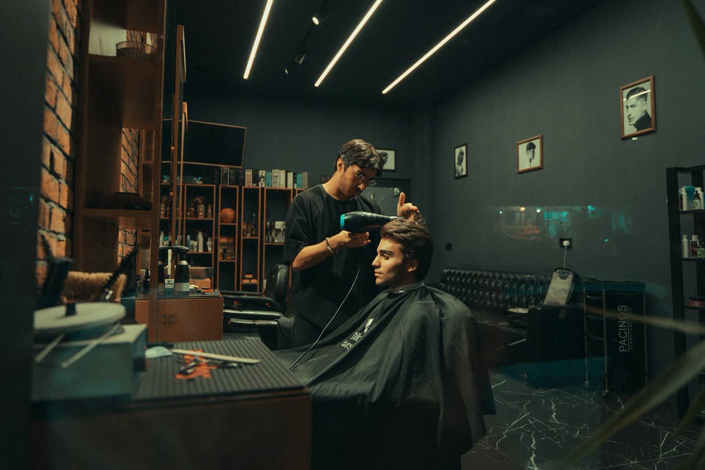
- Generic stock with no link to the topic
- Heavy colour tints over the whole photo
- AI-generated people or fake customer photos
Plain words. Real numbers.
Write the way a helpful expert talks to a busy owner. Short sentences, everyday words, and a clear next step. Every number needs a source, and we never claim results we can't show.
- “We text back every missed call within seconds.”
- “Leads contacted within 5 minutes are about 8x more likely to qualify (MIT / InsideSales).”
- “Plans start at $299 a month. Exact quote after the free audit.”
- “We leverage cutting-edge AI to revolutionise your lead funnel.”
- “Guaranteed 10x ROI for every client.”
- “Trusted by thousands of businesses worldwide.”
- US pagesUS spelling: color, optimize, inquiry.
- Surat pagesIndian English and ₹ prices.
- No long dashesUse a full stop or a colon instead.
- Check spellingBefore anything is published.
Need another file or format?
For print files, other sizes or permission to use the logo, email kishan@adbuddy.in.
Same rules, smaller canvas.
One idea per post, a big clear headline, a source under any number, and the logo in the bottom-left corner. Pinterest pins are 1000 × 1500 px; Instagram posts are 1080 × 1350 px.